Green Snow wanted its identity to convey how it works closely with its brand partners; the eco-sensitive nature of the business (putting pressure on its supply chain to eradicate the use of single-use plastics); and its strength in sports leisure (it boasts brands including Team GB, Team Sky and Rouleur.cc. as clients).
Successful brands own space in our lives. They stand out, have a purpose, they mean something. If you're looking for an agency to help make and shape your brand, we can help.
Our approach
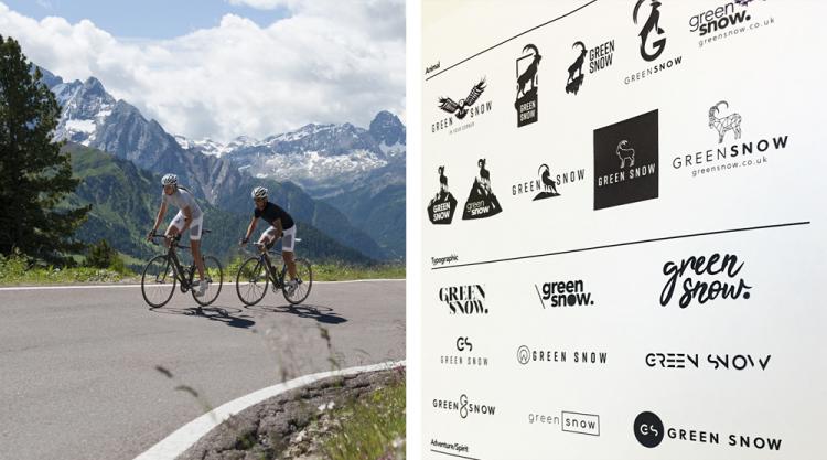
We approached the brief exploring three distinct visual treatments:
- an emotive symbol led approach to align characteristics and values, settling on an Alpine ibex as they convey strength, are social and work in groups
- a minimalist, typographically-led approach to convey a unique, high impact brand that is instantly recognisable
- a third icon-led concept influenced by Green Snow’s links to sport and outdoor pursuits.
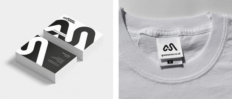
We worked with Green Snow to develop a typographically-led logo incorporating the ‘outdoor pursuits’ concept and constructed the logo in two parts: the GS logo mark and the GS logo type.
The outcome
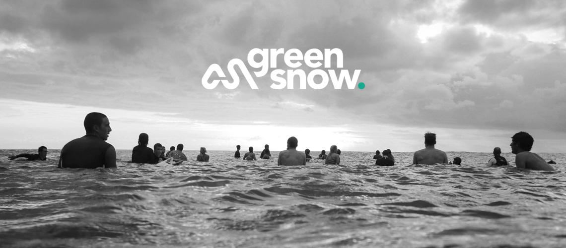
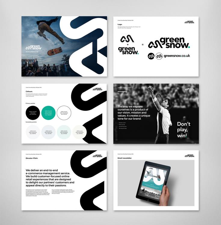
The final logo incorporates an imagined cycle track made from the initials ‘G’ and ‘S’. This is accompanied by clean, lower-case, sans serif typography for the brand name. The final flourish is a green full stop; a reminder that Green Snow’s social responsibility and eco-friendly values sit at the end of everything it does.
In addition, the new verbal identity provides a framework for how Green Snow articulates its core principles, internally and externally.
“Carswell Gould superbly interpreted our brief and understood exactly what our new brand identity needed to represent. It is now in place and is having an immediate positive impact on how we are perceived by prospective new clients.”
Paul Bolwell, Brand Director.