East Sussex College’s requirement was to manage and create an entirely new visual and verbal brand identity for the college and its campuses in Lewes, Eastbourne, Newhaven and Hastings.
We spent time on each campus, talking to students and staff, to gain a greater understanding of the new college in order to steer the development for the brand. We used these sessions to uncover the uniqueness of each campus as well as the similarities they shared, so that we could surface these consistently in the work.
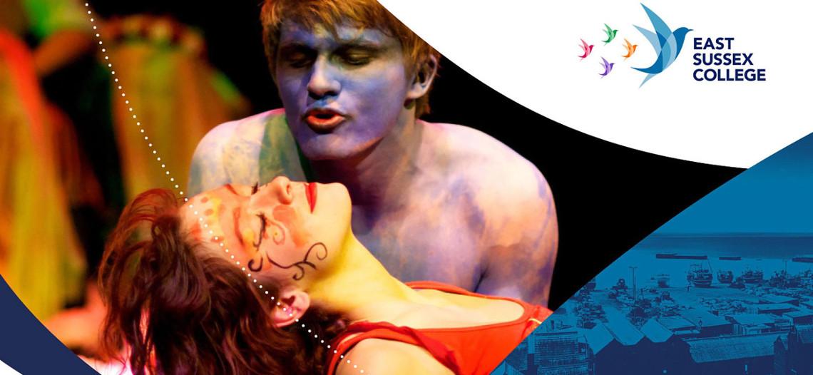
The importance of the location of the college and its campuses came through strongly in all the conversations we had. We illustrated this through the use of the martlet (the county’s heraldic symbol) as the logo device, and the different colours chosen for each of the campuses. We also incorporated location photography in the visual branding.


Our research clearly showed us the importance to incorporate both the county name and the individual town names for each of the campuses, in order to keep the sense of localness for its core 16-18 year old audience.
The colours, fonts and imagery are designed to be fresh and modern, but also timeless in nature as it is vital the identity keeps looking fresh for many years to come.
We gave the language and tone of voice for the college a fresh new feel, designed to appeal to the range of audiences the college needs to talk to. We provided a full set of tone of voice guidelines with examples on best practice for all to follow.
The college was also provided with detailed brand guidelines with ‘play-by-play’ instructions for all in-house marketing and design staff at each of the campuses, to guide their use of the brand and help them to be ambassadors.
We are extremely proud of our work with East Sussex College and believe the new brand we have developed for them will be a huge asset in their future journey.


